Making 1,560 rows of impact data legible, navigable and shareable for Health Canada
In partnership with
Client
Intrinsik | Health Canada
Year
2026
Industry
Health / Government
Services
Engineering, Data + Visualization
Visit
pathwaysofeffects.ca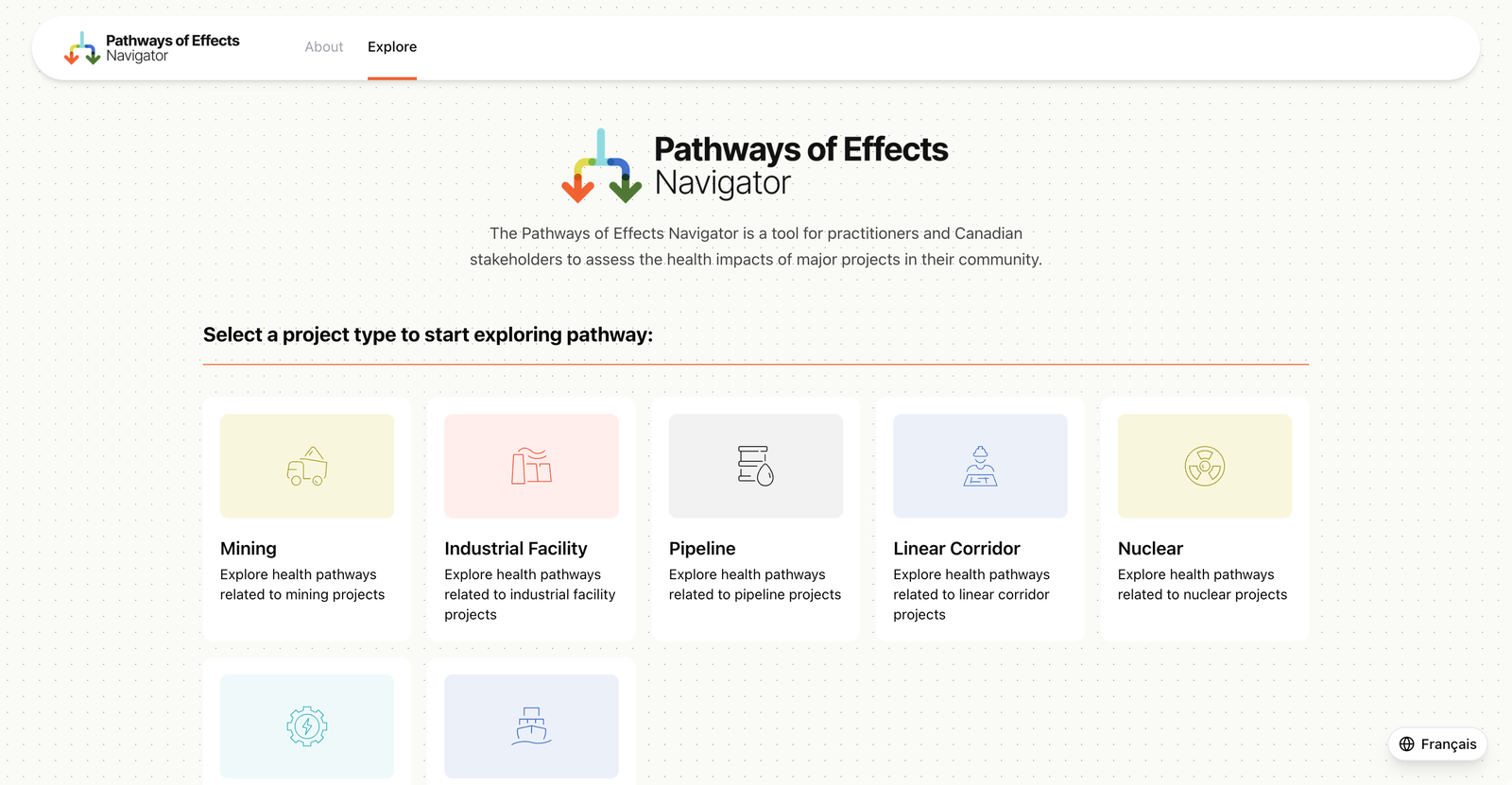
POE Navigator — from spreadsheet data to interactive bilingual pathway graphs
Health Canada had years of research on how major projects affect communities. It was locked in spreadsheets that only a handful of people could read.
We built the POE Navigator: an interactive graph tool that lets anyone trace how a mining operation, pipeline, nuclear facility or hydropower plant cascades through environmental and health impacts. Select a project type, pick a phase, choose a trigger, and watch the pathway unfold visually, from cause to consequence to health outcome.
Built in 140 hours over 6 weeks. Bilingual from day one.
1,560
Pathway records across 7 project types, parsed and visualized
12 wks
From first commit to a functional bilingual graph tool
2
Languages served from a single CSV architecture
24
Columns per record, including multi-value cells
The Challenge
Why the data stayed buried
Access was gatekept by expertise
Understanding the pathway data meant knowing which spreadsheet to open, which columns mattered and how values in one field constrained values in another. Without that institutional knowledge, the data was opaque.
Relationships were invisible
A single trigger could cascade through multiple intermediate factors before reaching a health outcome, with cross-pathway linkages connecting effects that seemed unrelated. Spreadsheets can't show that.
Sharing was manual
When a practitioner found something worth discussing, the best they could do was describe it in a meeting or screenshot a spreadsheet. No links, no saved views, no way to point someone at exactly what you're seeing.
Bilingual access was fragmented
As a Health Canada initiative, content had to work in both English and French. Maintaining parallel datasets introduced sync risks and duplication that got worse with every update.
The data was assumed to be too complex to visualize
24 columns per row. Multi-value cells with delimited lists. Natural language connections between concepts. The prevailing belief was that this data was too messy for any structured visualization.
The source data: 1,560 rows of pathway records across 24 columns, with multi-value cells and bilingual content
Goals
What success looked like
Make it legible to non-experts
A community member should be able to select a project type, choose a phase and trigger, and immediately see a clear graph of how effects flow from cause to health impact.
Surface hidden relationships
Cross-pathway linkages between effects that span different themes needed to be visible at a glance, not buried in column references.
Make findings shareable
Practitioners needed to send colleagues a link to a specific pathway view, export it as a PDF, or email it directly.
Bilingual by default
English and French as first-class citizens. Switch languages without losing your place. One URL, both languages.
Built with
01 — Our Approach
Treating the CSV as the source of truth
The conventional move would have been to ask the domain experts to restructure their data into something developer-friendly. We went the other direction.
We built parsers that worked with the existing spreadsheet structure, warts and all. Multi-value cells got split. Implicit relationships got extracted. Duplicate concepts got resolved. The graph schema (what counts as a node, an edge, a layer, a linkage) was designed from scratch, but the raw CSV remained the canonical source. Domain experts kept working in Excel. The application adapted.
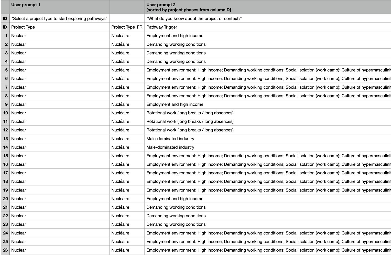
The raw CSV: 24 columns per row, multi-value cells, bilingual content
02 — Our Approach
Progressive disclosure of complexity
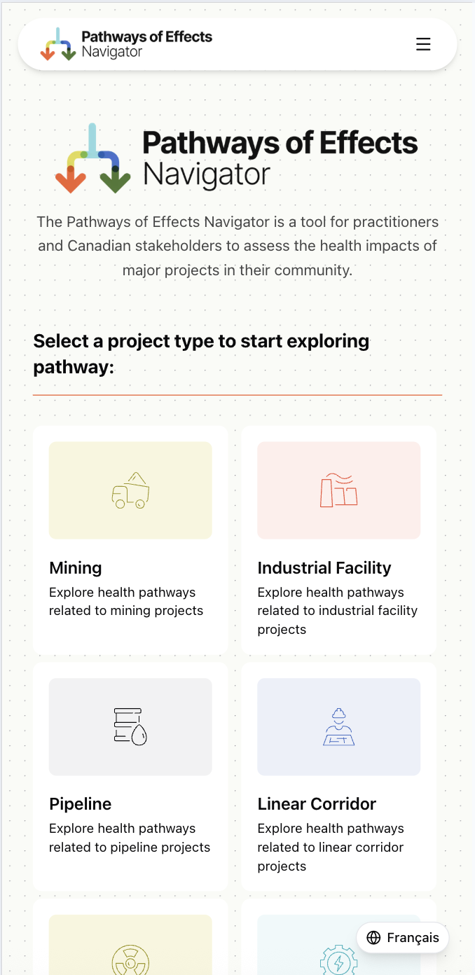
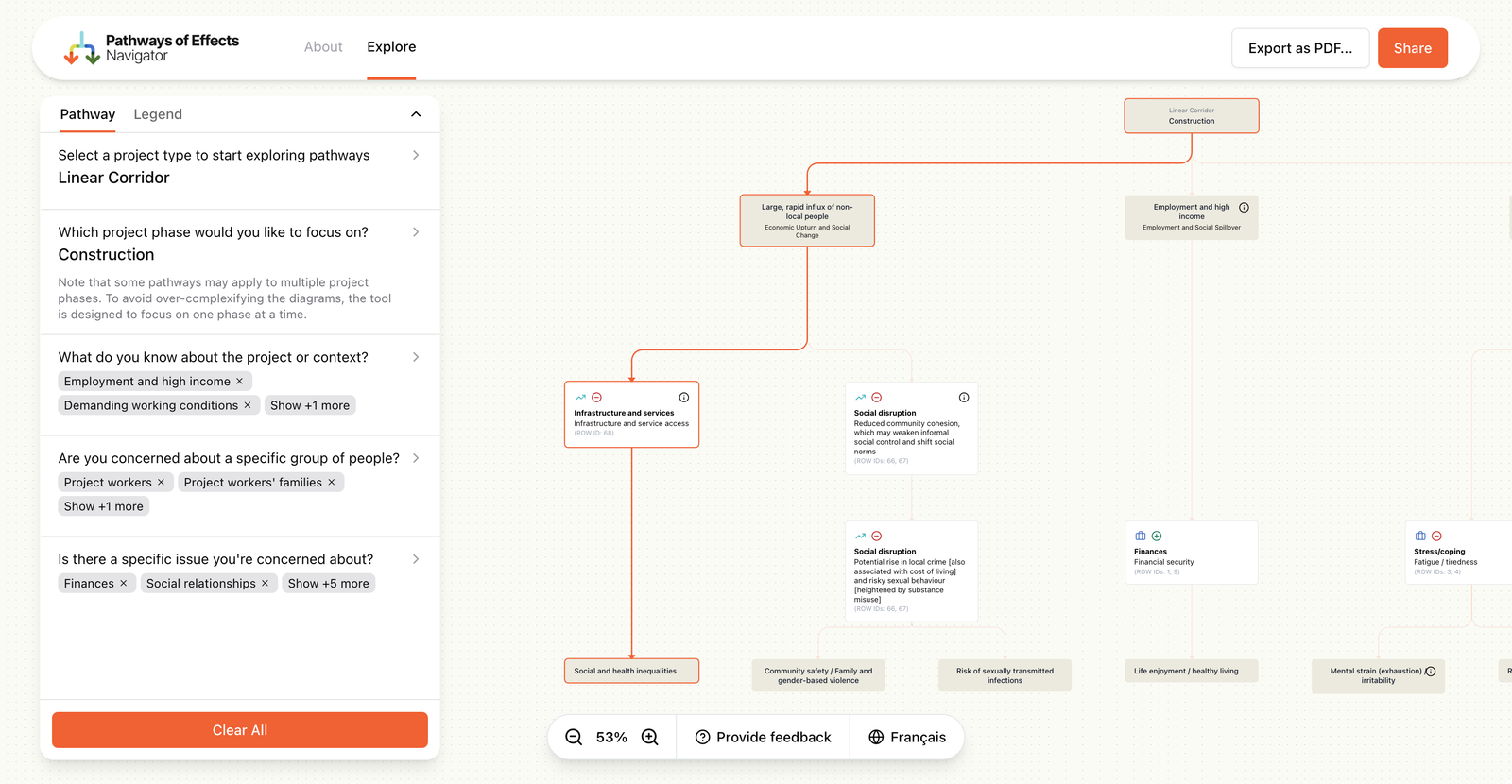
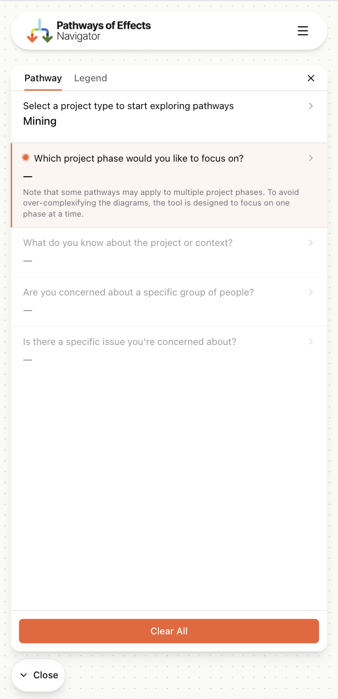
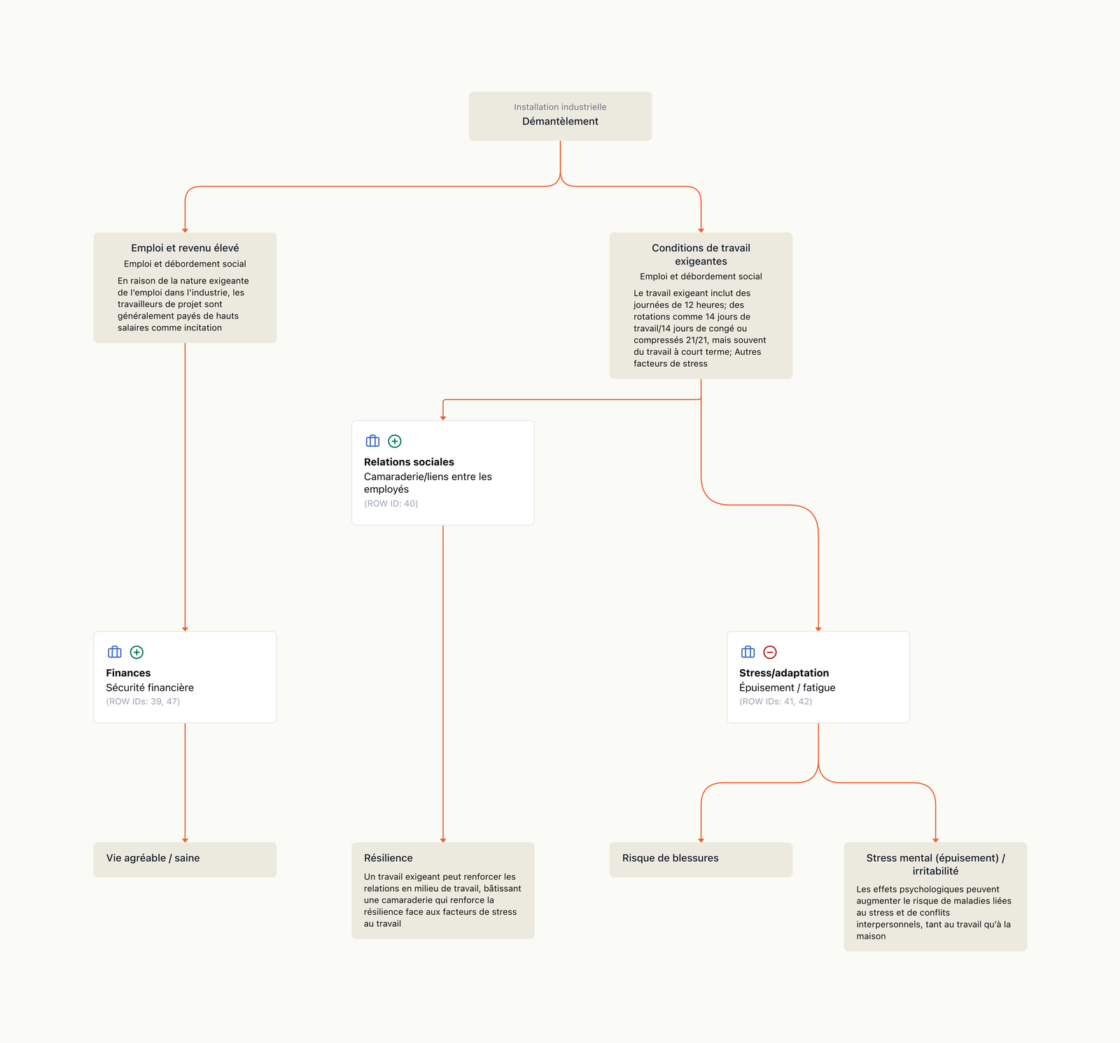
Showing the full graph upfront would have been overwhelming. Instead, the interface reveals complexity in stages: pick a project type, then a phase, then triggers and populations, then a pathway theme. Each step narrows the dataset and builds the graph progressively.
Only when you select a specific theme does the full pathway appear, from trigger through intermediate factors to health outcomes. The user controls how deep they go.
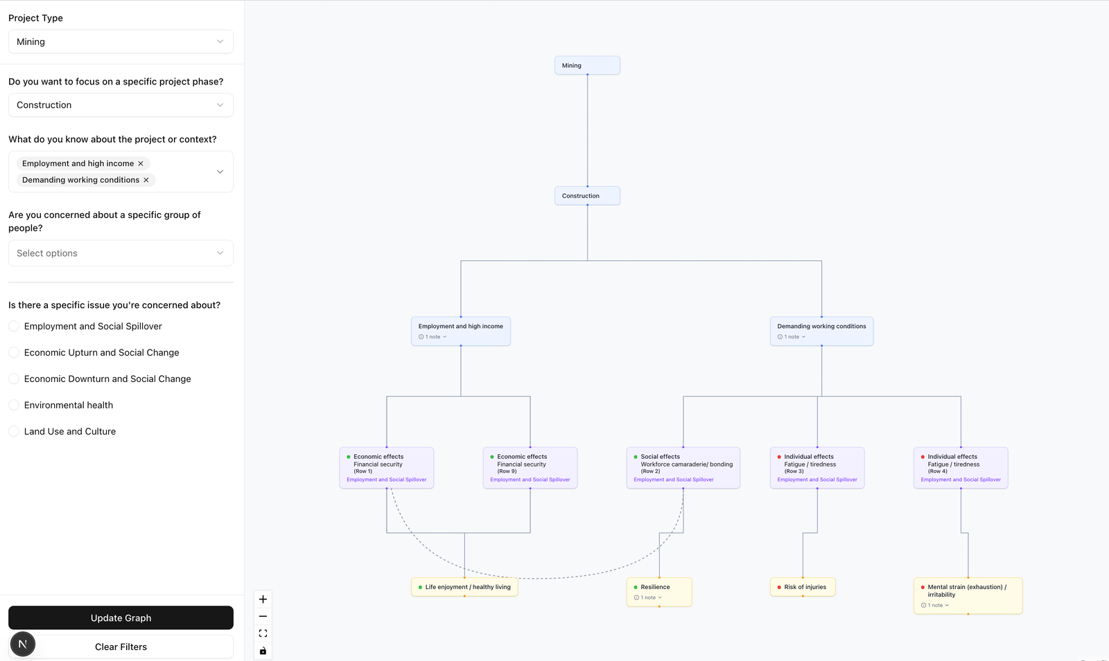
Each filter selection narrows the dataset and builds the graph one layer at a time
Each filter selection narrows the dataset and builds the graph one layer at a time
03 — Our Approach
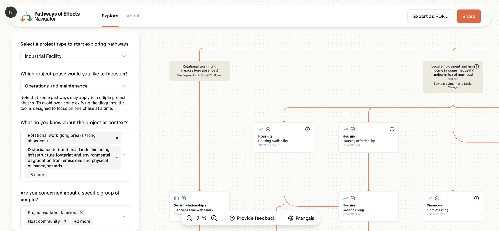
Bilingual without duplication
Maintaining separate English and French datasets would have meant inevitable sync drift. Instead, we used a single-CSV architecture where French columns are suffixed with _FR. An index-based filtering system makes filter parameters language-independent: the same numeric indices point to the correct values in either language.
The result: a shared URL works identically whether you view it in English or French. No separate codepaths, no translation layer, no drift.
The same pathway viewed in French, served from a single CSV source
What We Built
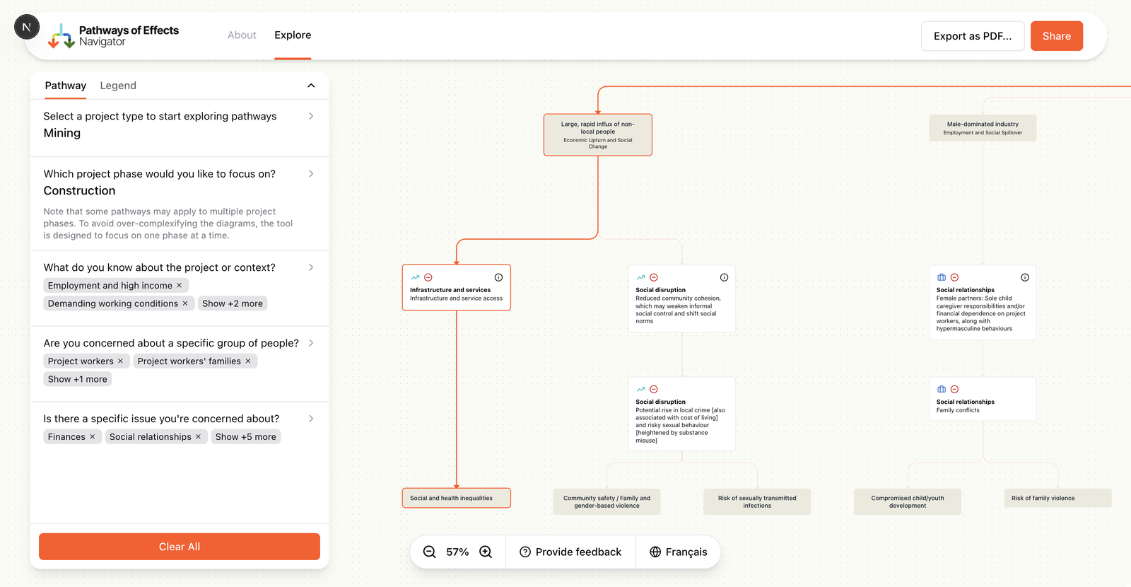
Interactive graph visualization
Color-coded, layered pathway graphs that flow left-to-right from trigger to health outcome. Animated edges show cross-pathway linkages between themes.
Data-driven form + filtering
Every form field, its options, and the graph it produces are driven by the CSV data. Adding a new project type means adding a CSV file and a manifest entry.
Shareable URLs
The full filter state is encoded in the URL. Send someone a link and they see exactly what you see. Works across languages.
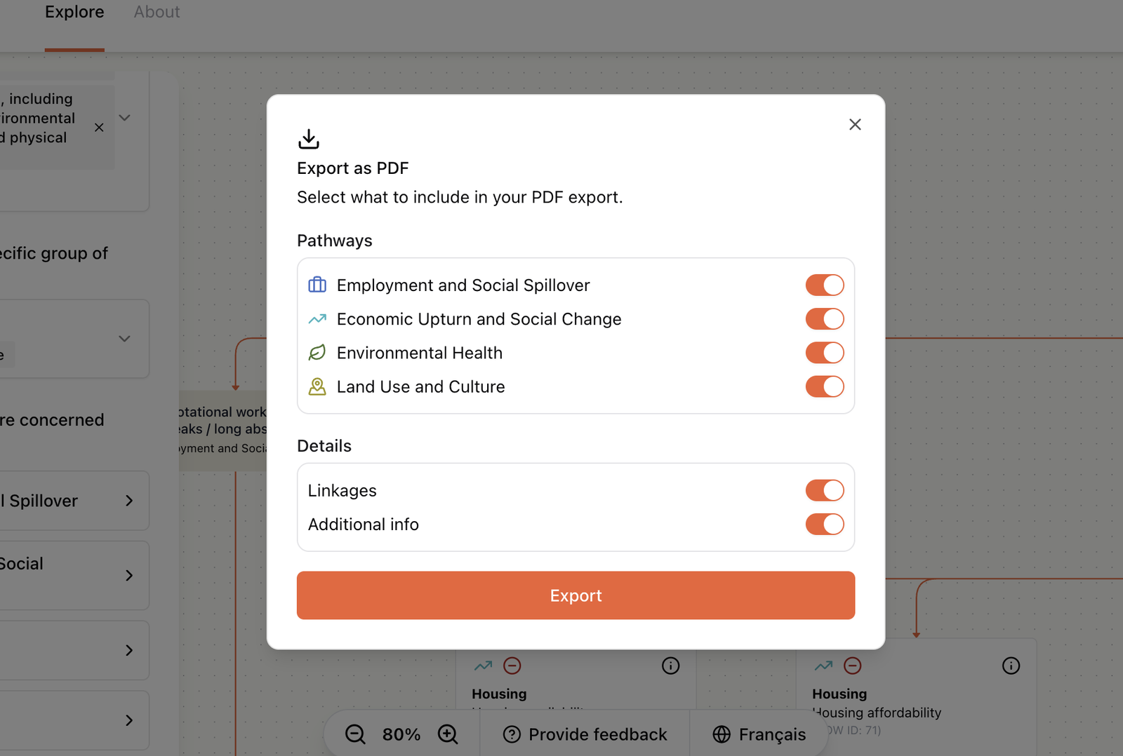
PDF export
Captures the current graph with optional detail panels for offline review, presentations and reports.
File-based versioning
Data versions live in numbered directories with override configs for backward compatibility. No database, no CMS. Domain experts update CSVs directly.
ELK layout engine
Automatic graph layout using ELK's layered algorithm with custom rank assignments. Nodes stay in their semantic layer regardless of how edges cross between them.
PDF export with configurable pathway toggles, and the full graph interface
Results
The POE Navigator turned years of research into something people can actually use. Practitioners explore pathways they've studied for years in a new medium. Community members trace how a proposed mining operation might affect their health without needing specialist knowledge. Government reviewers share specific views with colleagues via a URL.
Previously inaccessible data, now explorable by anyone
Community members, practitioners and government reviewers can all navigate the same data. No institutional knowledge required.
Hidden relationships made visible
Cross-pathway linkages between themes are rendered as animated edges. Employment changes during mining construction connect to community health, environmental exposure and social well-being, all in one view.
Fully bilingual from a single source
English and French served from one CSV architecture. Language-independent URLs mean a shared link works the same way for both audiences.
Content updates without developers
Domain experts at Intrinsik update pathway data by editing CSV files. No code changes needed. The form, graph and export all adapt automatically.
Lessons
Work with the data you have, not the data you wish you had. Building parsers for messy CSVs was harder upfront but meant domain experts never had to change their workflow.
Direct communication between developers and data owners shortened feedback loops by weeks. Requirements didn't get lost in translation between project managers.
Build the hard thing first. Data parsing, graph generation and filtering logic came before any design work. By the time we got to styling, the data pipeline was proven and the technical risk was behind us.
Index-based filtering over string-based filtering made bilingual URLs possible without a translation layer. A small architectural choice that paid off across the entire product.
Got complex data that needs to be understood?
We build tools that make tangled datasets legible, navigable and shareable. Let's talk about yours.