A dot becomes a line. Brand identity for Linear Festivals: performing arts along India's metro lines
Client
Linear Festivals
Year
2025
Industry
Arts + Culture
Services
Brand Identity, Logo Design, Art Direction, Typography
Visit
linearfestivals.com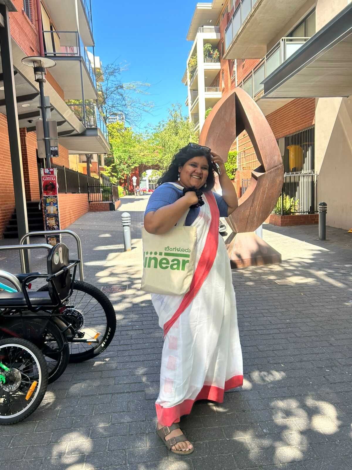
Linear, one motif, many treatments: a brand system built to move across cities, languages and art forms
Linear stages music, theatre, dance and arts festivals along the metro lines of Indian cities. The idea is simple: make culture as easy to reach as the nearest station.
Getting to a show in a dense Indian city usually means traffic, parking and a decent excuse to stay home. Linear's answer is to put the culture on the metro line itself, with performances a short walk from the stations people already use every day. We worked with them to turn that into a brand.
It came down to one picture. A metro line is a row of dots, and every dot is a performance near a station. So the identity runs on a single move: a dot becomes a line. The wordmark, the graphic language, the palette, the type and the art direction all grow out of it, and all of it is built to travel, whether it lands on a phone screen or a screen-printed tote bag. It's the same brand the Linear Festivals website was later built on.
1
Core motif, a dot becomes a line, running through every asset
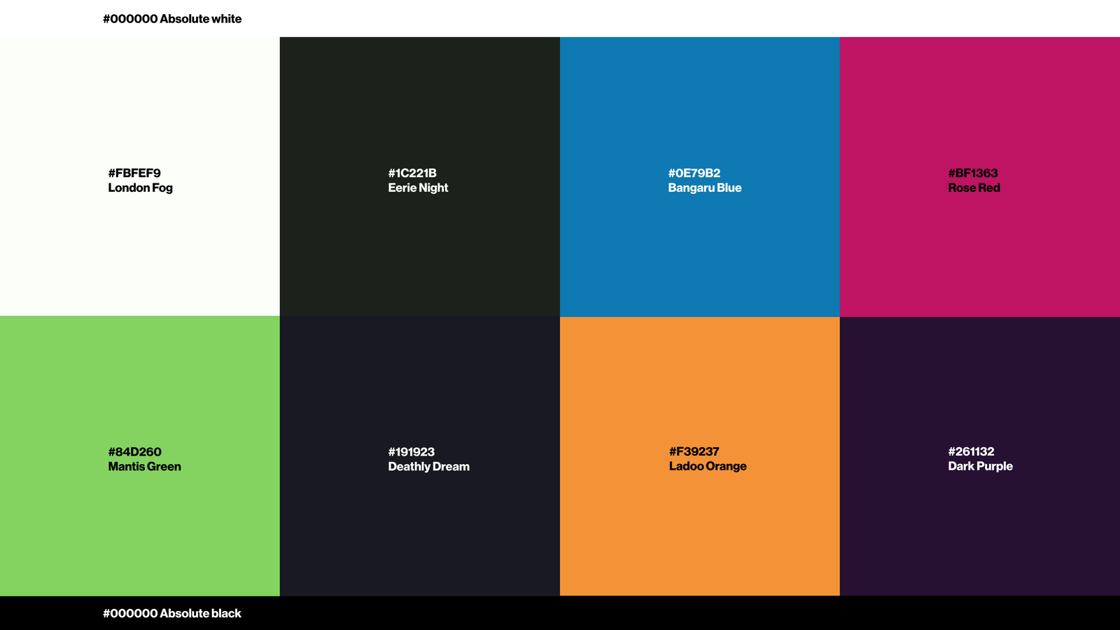
10
Colours in the palette, each named, from Mantis Green to Rose Red
2
Scripts the system speaks, Latin and Indic, with room for more
3×
Clear space locked to the motif's square, so it holds at any size
The Brief
An identity built to move
Make culture feel close
Accessibility is the whole point of Linear. The brand had to feel open and public, like something you run into on your way home, not a velvet-rope event you need an invitation to hear about.
Portable before pretty
It had to work out of the box in rough conditions. One colour on a screen-printed tote, a badge the size of a coin, a poster pasted on a wet wall, a favicon. Looking good only in a clean PDF would have counted as a fail.
Many cities, one family
Sub-brands like Linear Bombay and Linear Bengaluru had to read as the same brand wearing a different name, never a fresh logo redrawn for each city.
Many scripts, one system
India isn't one language. The identity had to hold Latin and Indic scripts together, Devanagari for Hindi and Marathi, Kannada for Bengaluru, sometimes switching inside a single layout, without looking bolted together.
Many art forms
Music, theatre, dance and visual arts all sit under Linear. The brand had to feel at home next to a classical recital and a midnight gig.
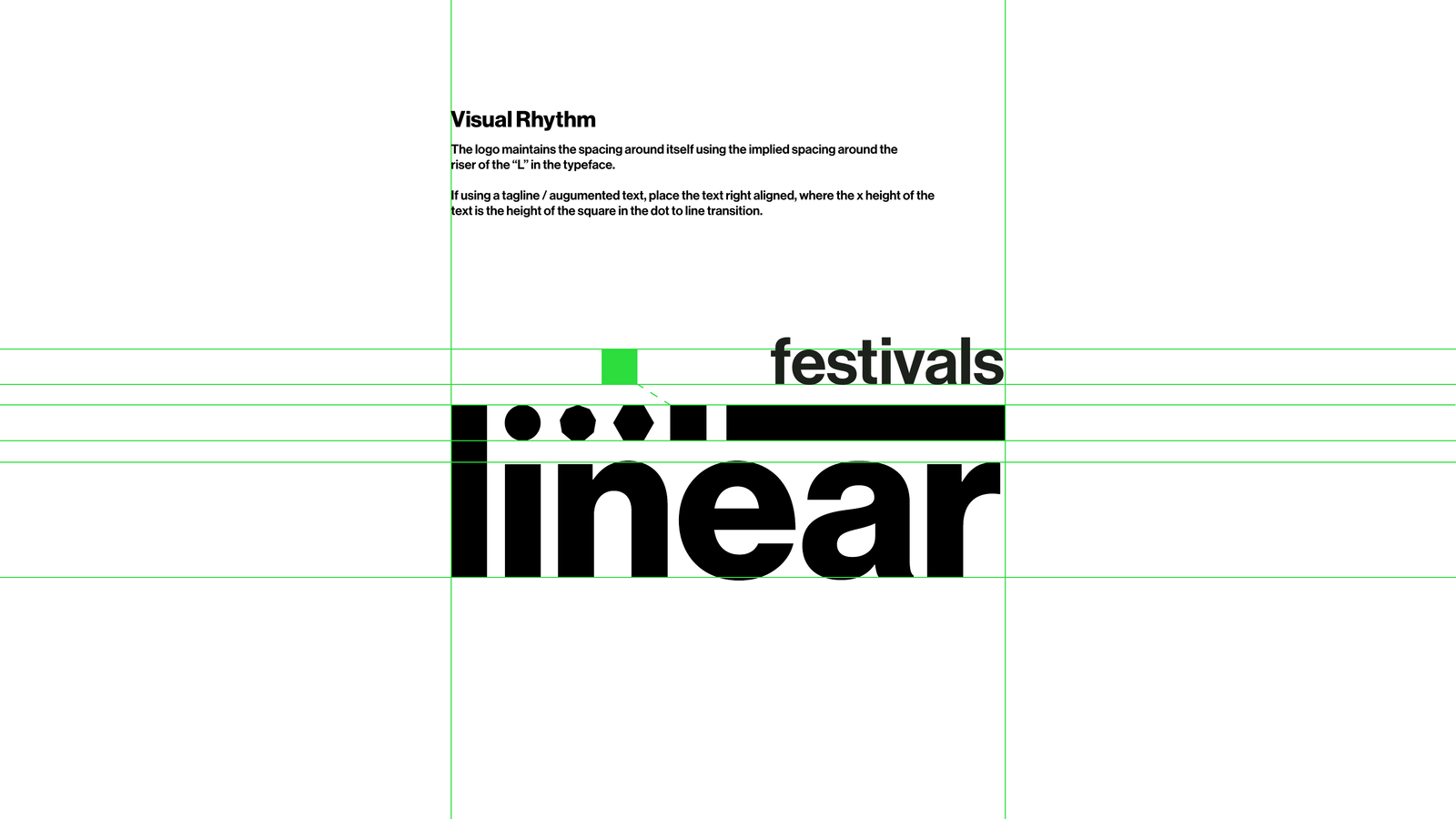
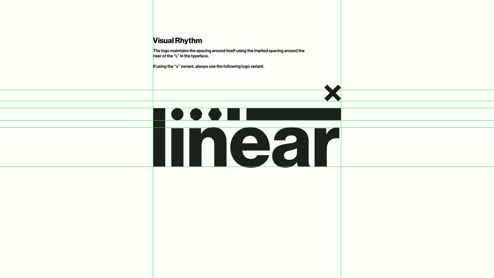
Built-in flexibility: a 'festivals' lockup and an 'x' partnership variant, both governed by the same visual rhythm
Goals
What success looked like
A motif, not just a logo
An ownable graphic idea that could be lifted out of the wordmark and used on its own, on tickets, social, signage and screen.
Rules that free people up
Guidelines tight enough to keep the brand consistent across many hands, loose enough that designers could play with colour, language and imagery.
A palette that divides, not decorates
High-contrast colour used like a line through space, to separate, structure and energise, never as polite background wash.
Ready to be built
An identity defined precisely enough that it could be handed straight to engineering and rebuilt, pixel for pixel, on the web.
01: The Idea
A dot becomes a line
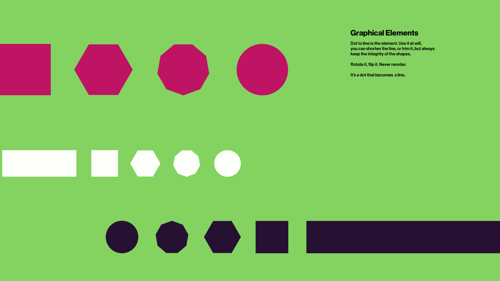
The motif comes straight off the metro map. A line is a row of stops. Each stop is a dot. Each dot is a performance happening near that station. Watch one dot stretch into a line and you've drawn the whole idea: a single point becoming a route, culture running down the track. The shapes carry it, a square, a hexagon, an octagon, a circle and a bar, always in that order.
It rides above the letters of linear in the wordmark, and it lifts straight out to stand on its own. Keep the integrity of the shapes. Shorten the line or trim it, rotate it, flip it. Just never reorder it. A dot always becomes a line.
The element: a dot becomes a line. Trim it, rotate it, recolour it, never reorder it.
02: Colour
Be like a line. Divide with colour.
Linear's palette is built for contrast. Ten colours, each one named, from Mantis Green and Bangaru Blue to Rose Red, Ladoo Orange and Dark Purple, anchored by London Fog and Eerie Night and the absolutes of pure black and white.
The rule: don't be shy. When there's colour to play with, avoid plain black and white and let the palette divide the space like a line. When you're in monotone, go all the way, pure black, pure white, full contrast.
Ten named colours, built for high contrast and confident division of space
03: Typography
Type that breathes
The typeface is Neue Haas Grotesk Display, used in medium and bold. Emphasis comes from mixing those two weights, never from italics, and the type is always given room to breathe with generous whitespace.
Linear's roots are theatrical, so the voice leans on the stage: “All the world's a stage, and all the men and women merely players.” Confident, quotable, set large.
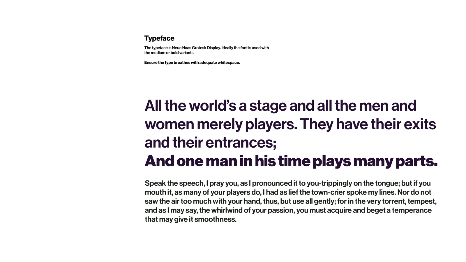
Neue Haas Grotesk Display in medium and bold, emphasis by weight, never italics
04: Imagery
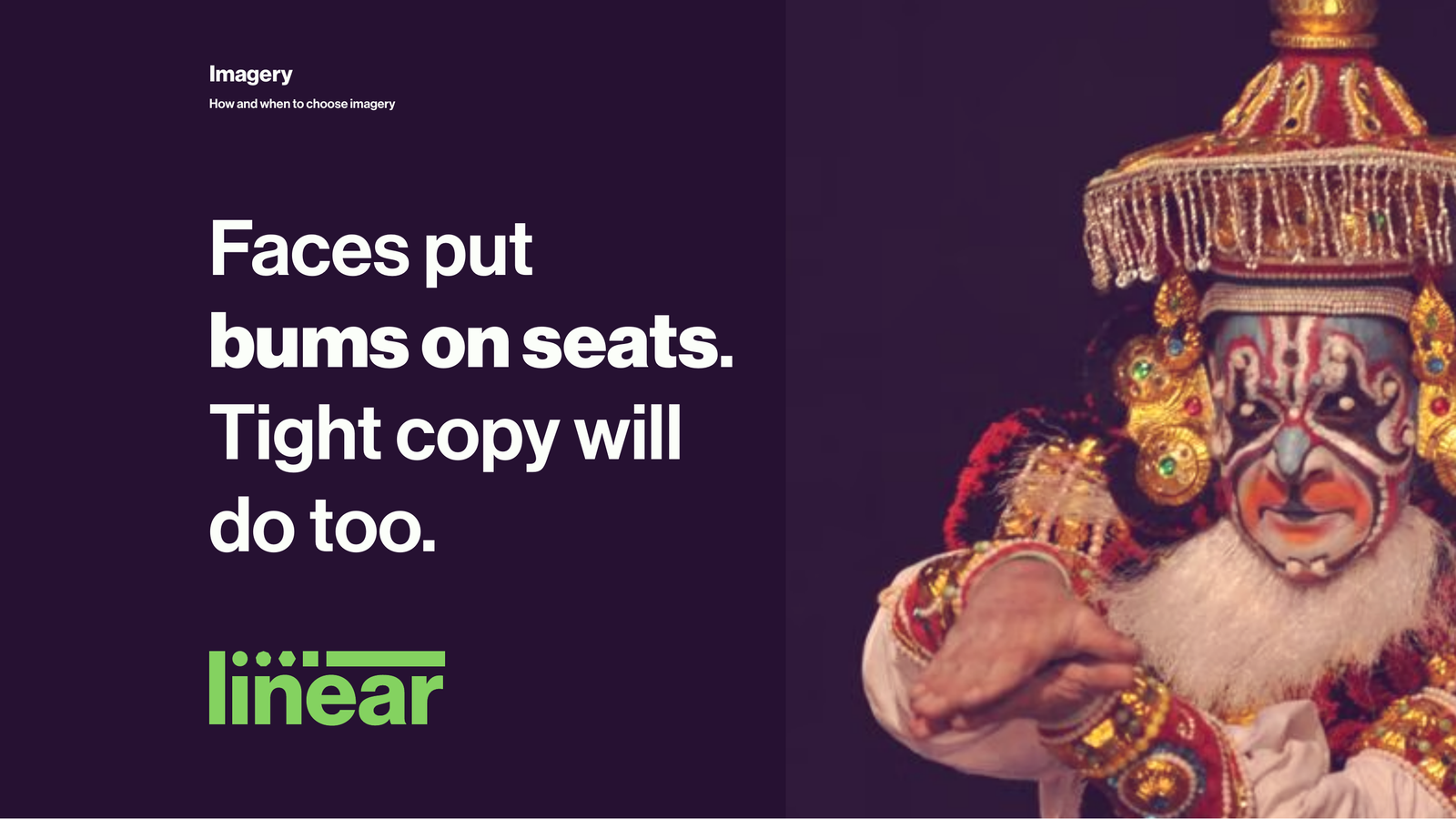
Faces put bums on seats
Performance is about people, so imagery leads with faces, performers in full costume, mid-expression, shot against deep colour fields. When there isn't a face to use, tight copy and the dot-to-line motif carry the frame instead.
Negative space is part of the picture: highlight it with close-set type, switch languages when the moment calls for it, and never be shy about scale.
Faces first; tight copy and the motif when there isn't one
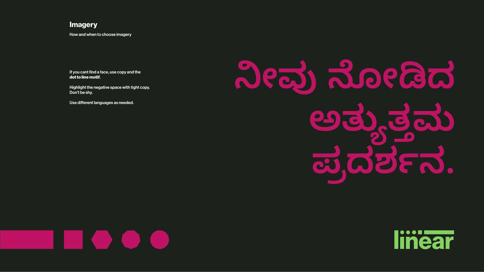
Different languages as needed: here, Indic set large in Rose Red
05: Built to travel
Made to be printed, pinned and worn
Linear kept coming back to one word: portable. The brand had to survive the real world, not just a slick mockup. One colour on a screen-printed tote. A badge small enough to lose. A poster slapped on a wall in the monsoon.
So portability was a starting point, not an afterthought. The mark holds in a single colour, reads at pin size and drops onto merch without a fight. The same system carries Indic scripts inside the brand rather than beside it, and city sub-brands like Linear Bombay and Linear Bengaluru fall out of it without anyone redrawing the logo.
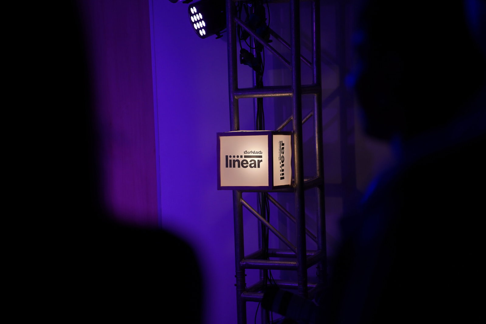
The same mark on a backlit cube on the truss, holding up in a completely different setting
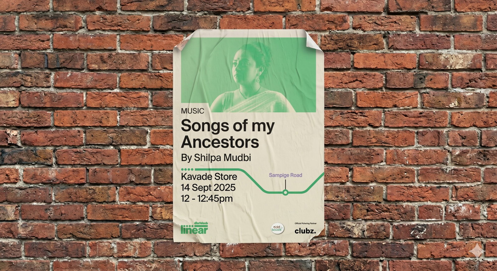
The poster system, with a real event turned into its own stop on the line
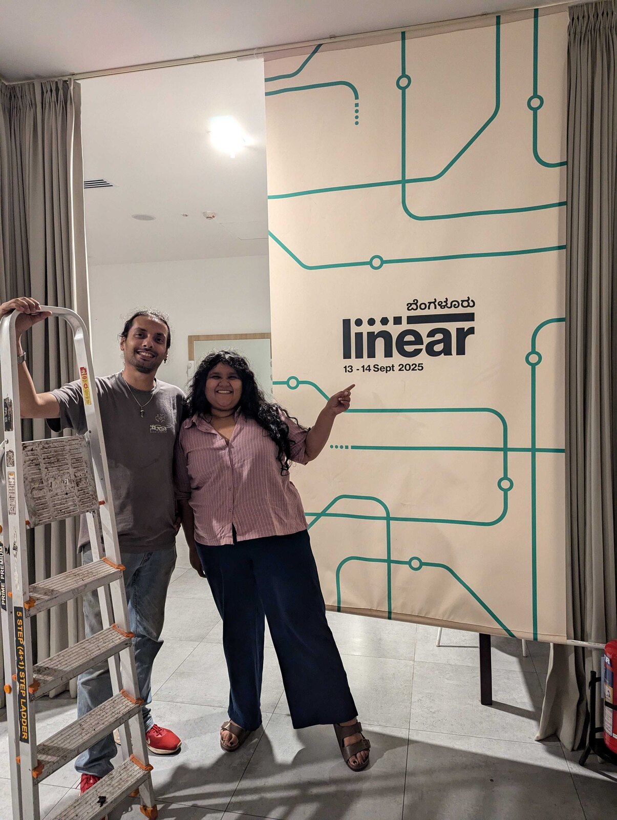
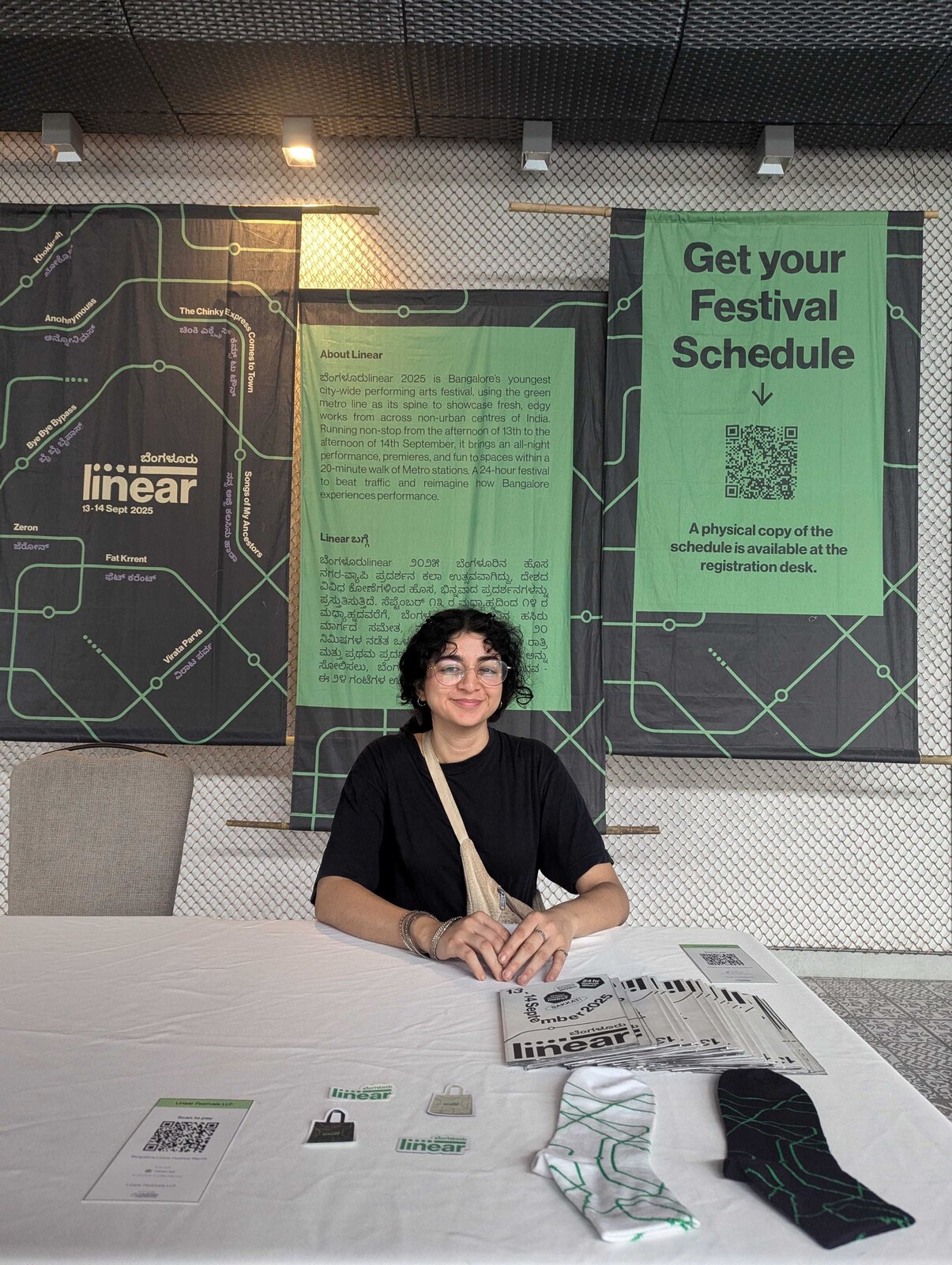
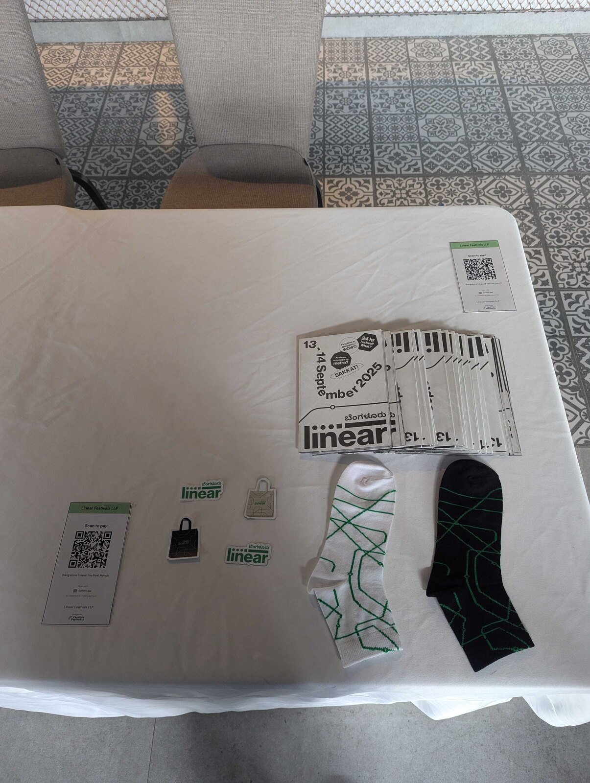
The brand live at the Bangalore festival, 13 to 14 September 2025: the metro-line backdrop going up, the registration desk, the merch table and a tote out in the world.
What We Built
The wordmark
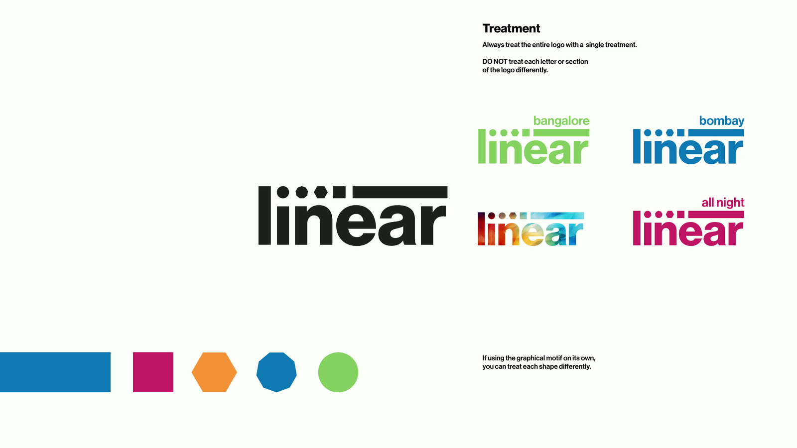
A lowercase 'linear' with the dot-to-line motif riding above the letters, the primary mark, with a single rule: treat the whole logo as one, never letter by letter.
The dot-to-line motif
An ownable graphical language (square, hexagon, octagon, circle, bar) that can be trimmed, rotated and recoloured, but never reordered.
City + festival lockups
Linear Bombay, Linear Bengaluru, 'festivals', 'all night' and an 'x' partnership variant, plus Indic scripts that sit inside the brand. All governed by one rhythm so it travels without fragmenting.
The colour palette
Ten named colours engineered for high contrast, with rules for full-colour and monotone use so the brand always divides space like a line.
The type system
Neue Haas Grotesk Display in medium and bold, with emphasis-by-weight rules, whitespace guidance and a theatrical, quotable voice.
Art direction for imagery
A photographic approach: faces first, deep colour fields, tight copy in the negative space, and multiple scripts, with the motif as the fallback when there's no face.
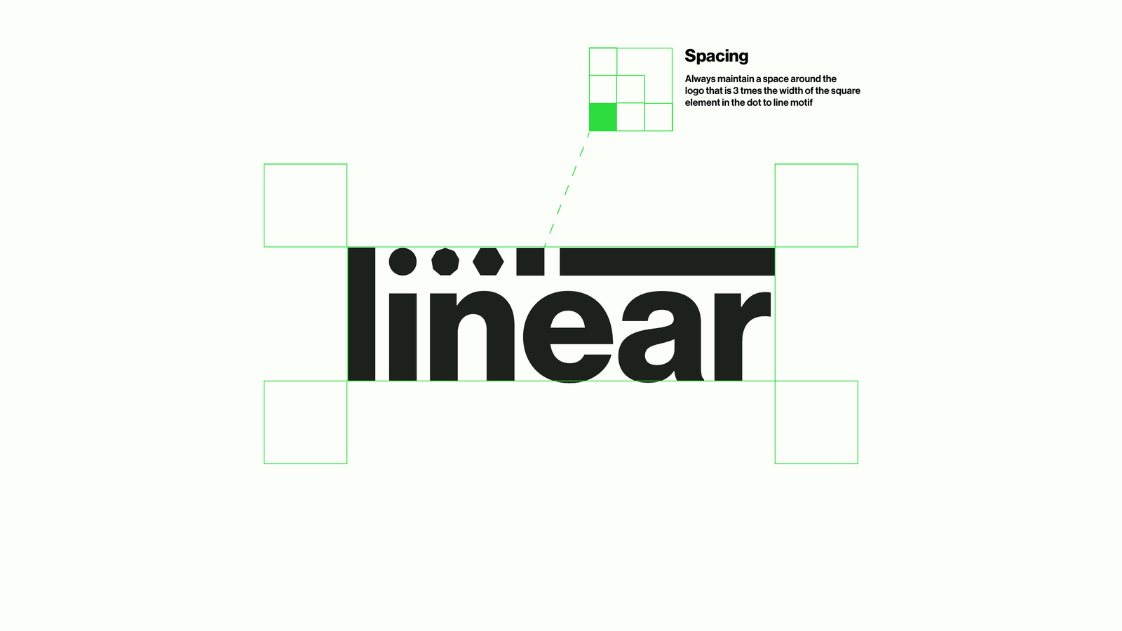
One treatment per logo, and clear space locked to three times the motif's square: the rules that keep it consistent in every hand
Results
Linear walked away with more than a logo: a system that any designer, in any city, can pick up and run with. One idea, infinitely flexible, and precise enough to be rebuilt in code.
One idea, endlessly extensible
The dot-to-line motif scales from a favicon to a stage backdrop and stretches across cities, festivals and partnerships without ever becoming a different brand.
A brand that travels across languages
Latin and Indic sit comfortably in the same system, so Linear can speak to each city in its own script without breaking its look.
Rules people actually enjoy using
Tight where it matters (logo, spacing, weight) and open where it counts (colour, language, imagery), so the brand stays consistent across many hands.
Built to be built
The identity was defined precisely enough to hand straight to engineering, which is exactly what happened when we built the Linear Festivals website on top of it.
Lessons
Find the one idea first. Everything (wordmark, motif, colour, imagery) gets easier and more coherent when it grows from a single move. For Linear, that move was a dot becoming a line.
Constrain the things that protect the brand, free the things that express it. Locking the logo and spacing while opening up colour and language is what lets an identity stay recognisable and never boring.
Design for the medium it will live in. Knowing the brand would become a website meant defining it with the precision code needs (clear hexes, exact ratios, explicit rules) long before the first line was written.
A motif beats a mark. A logo you can only place is far less useful than a graphic idea you can play with. The dot-to-line element does more work, in more places, than the wordmark alone ever could.
Need a brand that can actually be built?
We design identities with engineering in mind, systems that look sharp in a guidelines deck and hold up the moment they hit a screen. We did it for Linear, then built their website too.